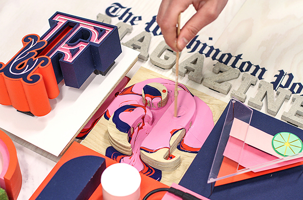
Swedish studio Snask’s handmade letterforms for The Washington Post
Typography is ubiquitous. Like all visual language, it is ingrained in everyday life, whether we notice it or not! A couple of weeks ago we were invited to Animal Studio in Bedford to take in the opening of their latest exhibition ‘The Art Of Type’. As we enjoyed the company and talents of the local creatives, we considered whether anyone is ever really out of office – designer or not – when it comes to type.
The Art Of Type – Type, font and lettering: a mixed show is open Tuesday to Saturday 10am – 5pm, until the 1st of August 2015, at 24 Castle Lane, Bedford, MK40.
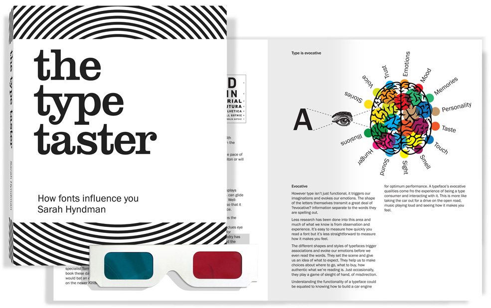
The exhibition features typographic pieces submitted by illustrators, graphic designers and fine artists from across Bedfordshire, Hertfordshire and further. We tweeted one our favourite pieces by illustrator Charlotte Perry to the Design Museum on #fontsunday during the Wimbledon men’s final. You’ll soon see why! Graphic Designer and author, Sarah Hyndman, best known as the Type Tasting studio, was also present at the opening night party, talking about her type workshops and introducing the busy gallery to her book The Type Taster, how fonts influence you. We think your point of view is great, Sarah!
Sarah Hyndman believes that we are all type consumers and that “fonts are like multi-sensory imagination grenades.” In The Type Taster she asks the reader to consider their own emotional response to type.
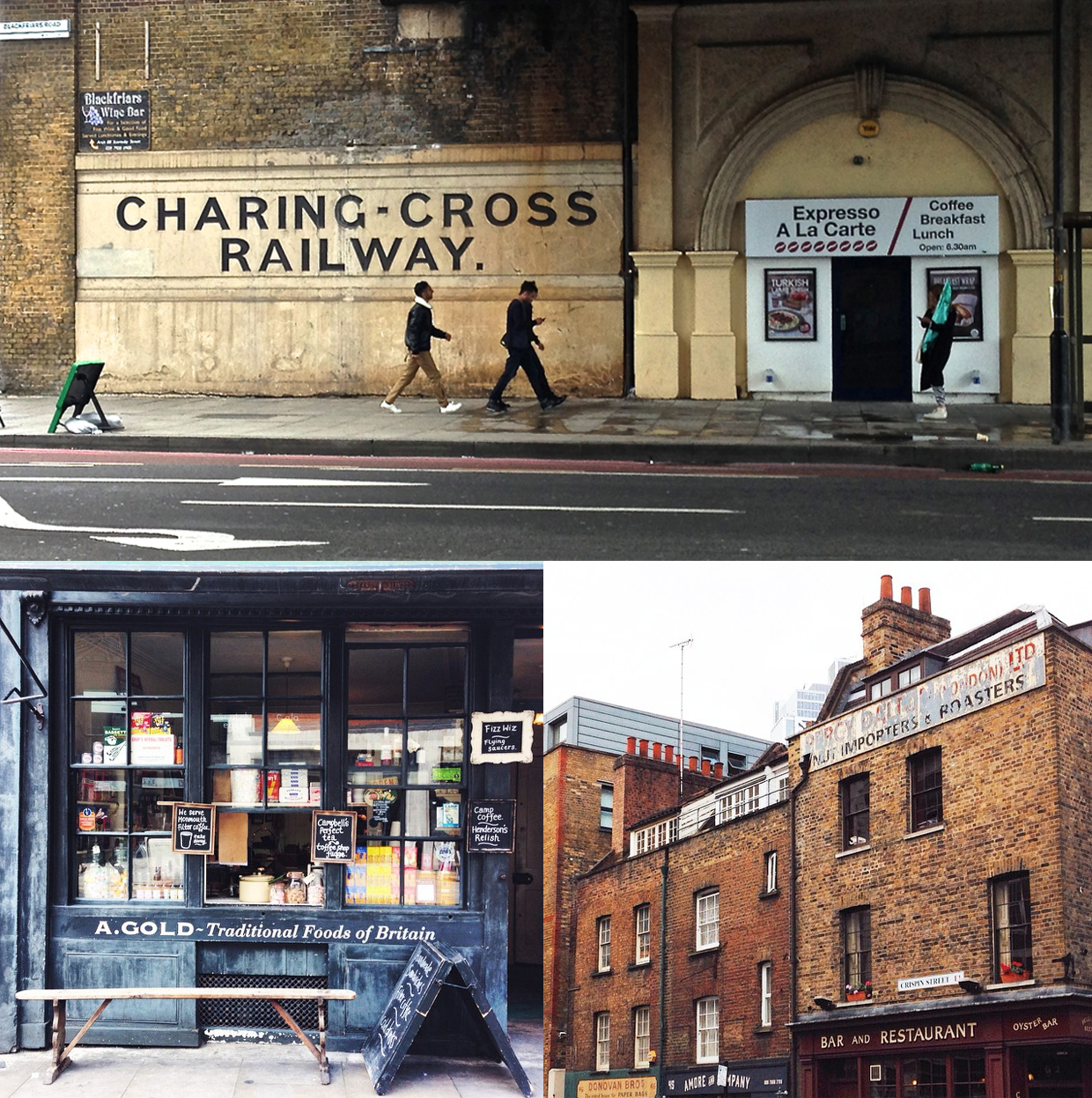
This is something that she helps people put into focus with her ‘Type Safaris‘, group tours that she leads around Dalston, London, asking people to consider: What does signage along a high street reveal about an area? And How do fonts influence your choices and what are they really telling you?
When we read about Sarah’s ‘Type Safaris’ in her book, we couldn’t help but think of Allan Peter’s similar venture, ‘Badge Hunting.’ Peters finds beautiful logos around the world and encourages readers of his blog to do the same. His website has now developed an intricate database with an exciting array of different logos from various eras. Inspired by the results of both these wild hunts type hunts we felt inspired to set off to do a mini safari of our own.
Our trip to London revealed many typefaces associated with the Big Smoke. We were fascinated to learn that Johnston is the typeface of the Underground. The bold, sans-serif letterforms are so familiar and comforting, they feel like a home from home. You’ll also spot the classic and more formal Albertus gracing road signs across the city, another sight clearly ingrained in city life. We find it fascinating that we can have such a strong emotional responses to font families. We’ve all grown up with them, seen them evolve and can track their descendants in history.
We fully support and encourage these safaris and hunts as they open our eyes to what’s around us! We are, as Sarah says, all type consumers and are influenced by typography on a daily basis. As designers, we are familiar with many of the points that the book raises but found it interesting to read about the different ways in which we all react to typography, whether consciously or not.
Typography evokes feeling, it affects emotions, enhances genres and alters how you absorb information. As a creative tool, it’s a designer’s best friend and as a creative weapon it can cause all manner of chaos.
Livi
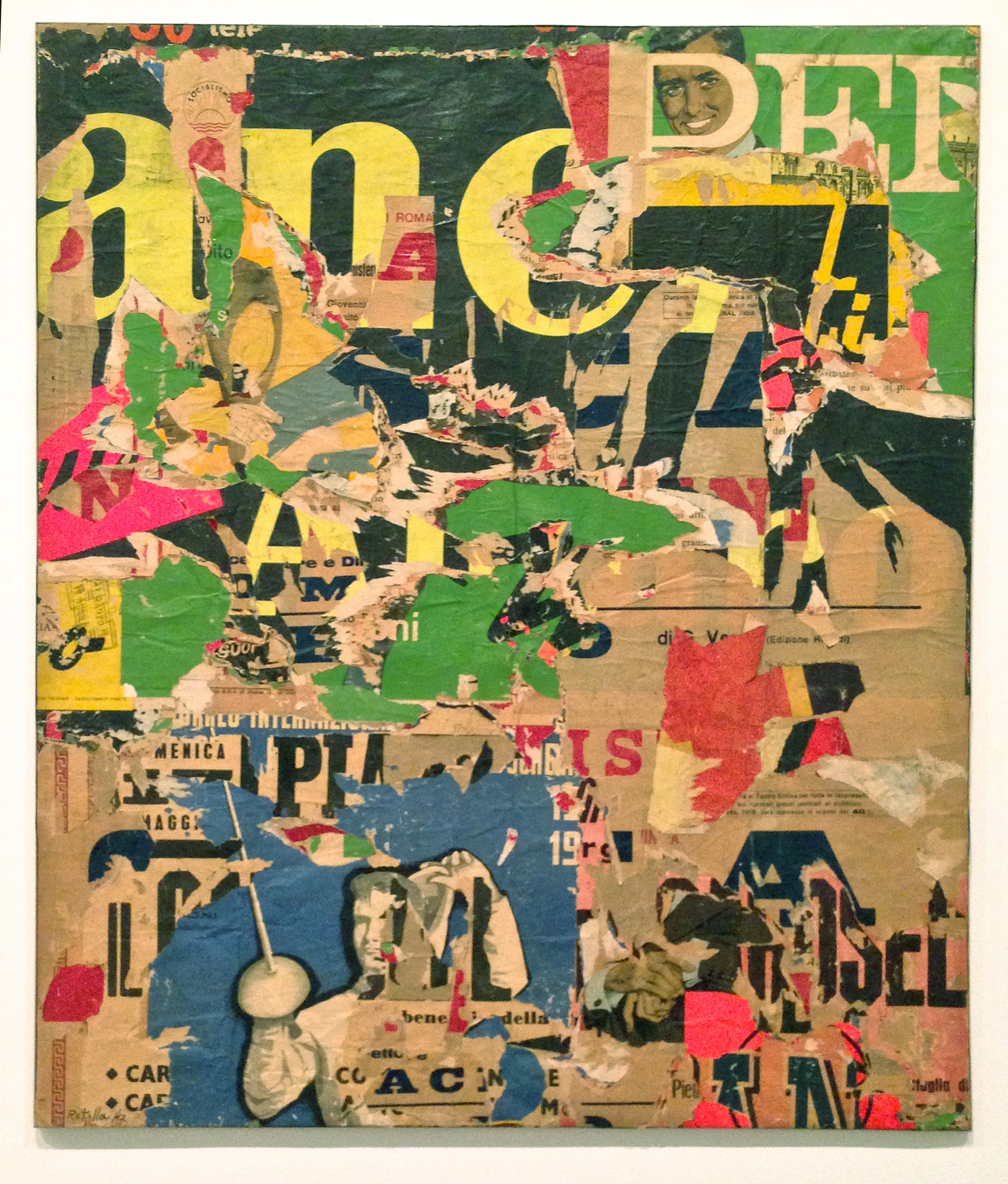
(Our blogpost’s featured image ‘With a Smile’ by Mimmo Rotella 1962)


Recent Comments